Datto SaaS Defense Dashboard
The Datto SaaS Defense Dashboard provides a useful and meaningful visual display of your organization's key platform information. The Dashboard allows you to quickly track your environment's product usage and effectively monitor threat prevention activity within your organization.
It includes six widgets (sections): Prevented Threats, Protected Email Accounts, End User Reports, Total Threats, Most Attacked Seats, and Scans Traffic.
Some widgets include the View All link that provides access to the SaaS Defense page associated with the widget. This allows you to review and work with only the individual records for which the widget's total number is calculated. 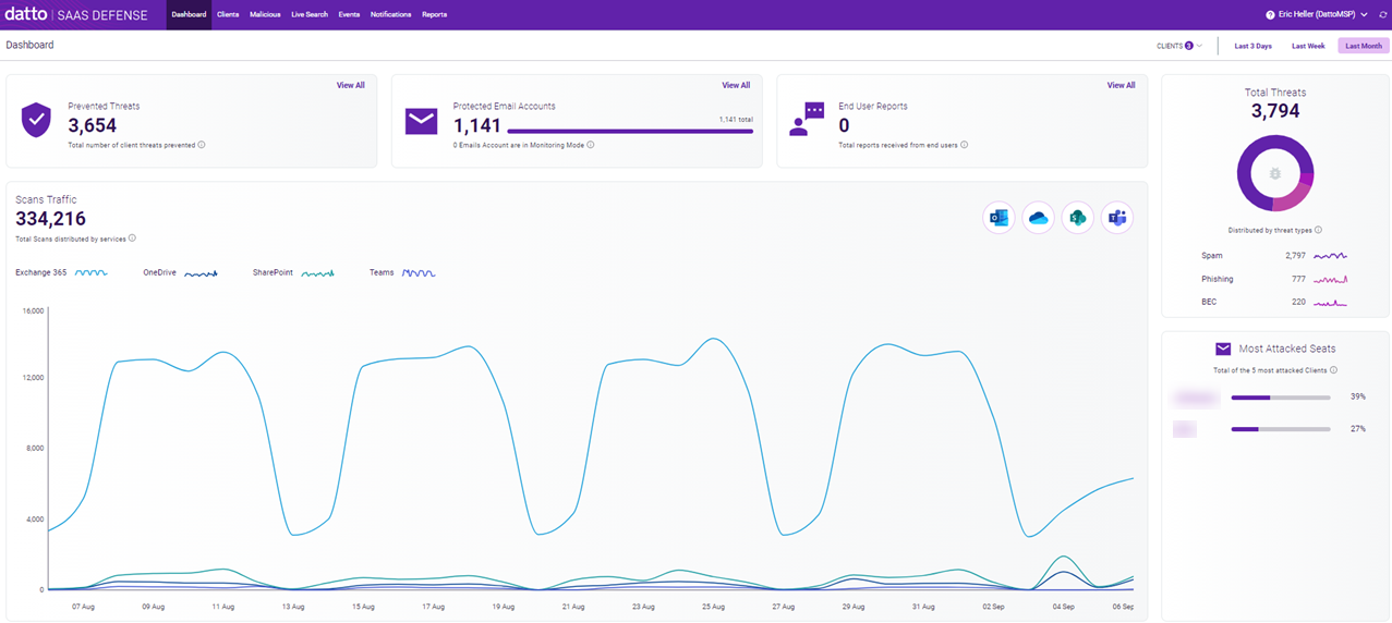
Filters
By default, the Dashboard displays the combined data for all of your clients. Using the Clients filter, you can display data for only the client or clients you select.
You can also filter the data based on time period. The options are the Last 3 Days, Last Week, and Last Month (selected by default).
The dashboard data updates as you select or change filter options.
Let's take a closer look at the data and tools provided in each widget. To do that, we'll use an example where seven clients have been selected using the Clients filter and the data displayed applies to the last week.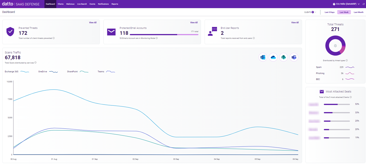
Prevented Threats
The Prevented Threats widget displays the total number of threats prevented by Datto SaaS Defense for clients operating in Prevention Mode. Filter selections you make apply to the results.
In our example, the Prevented Threats widget shows that during the last week, Datto SaaS Defense blocked 172 threats for the seven selected clients.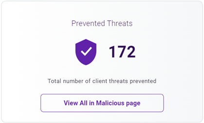
Clicking View All navigates to the Malicious page which lists each of the 172 scan records for you to investigate.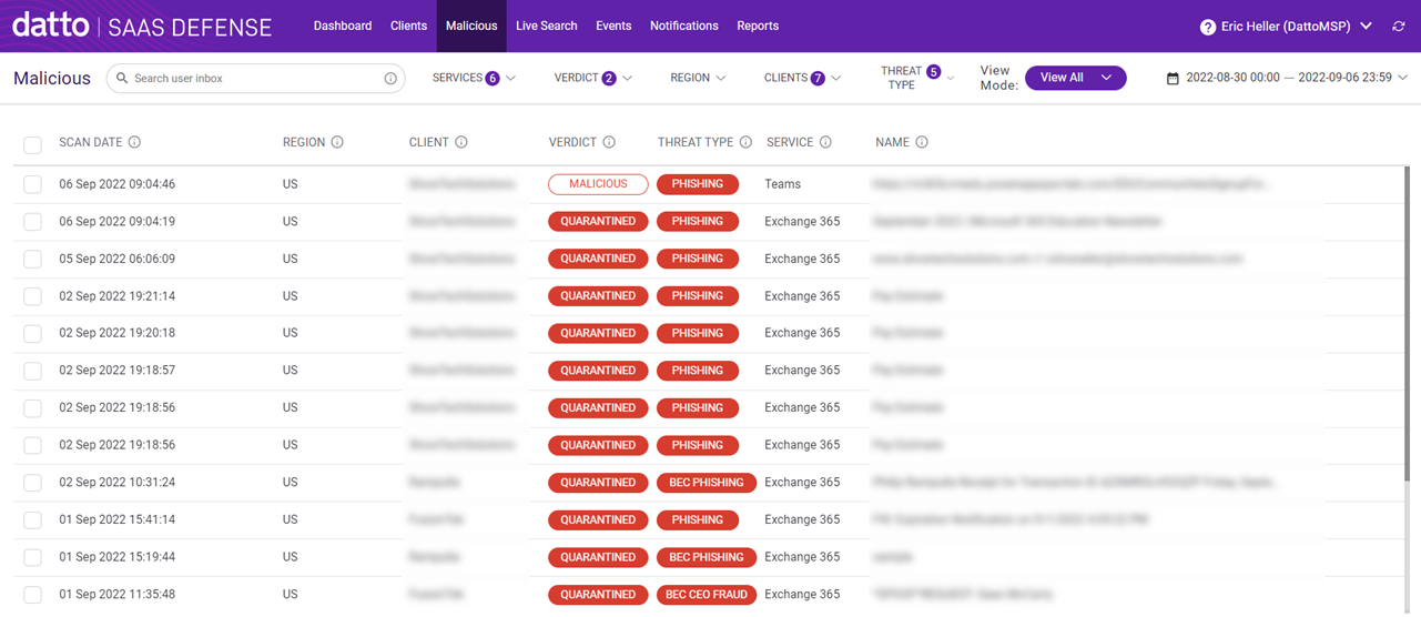
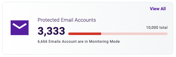
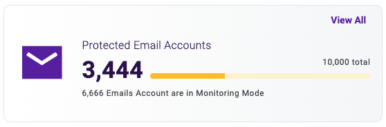
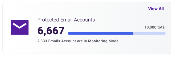
Protected Email Accounts
The Protected Email Accounts widget shows, from your total number of client email accounts, the number that are protected email accounts, meaning they are operating in Prevention Mode.
The color bar provides a visual indicator of the percentage of your client email accounts that are being actively protected:
- Less than 33%: Bar is red and alerts you that two-thirds or more of your mailboxes are in Monitoring Mode which is considered unsafe under SaaS Defense security standards.
- Between 33% and 66%: Bar is yellow and indicates that between one-third and two-thirds of your mailboxes are in Monitoring Mode which is considered unsafe under SaaS Defense security standards.
- More than 66%: Bar is blue and indicates that while two-thirds of your mailboxes are protected, up to one-third of your mailboxes are not being actively protected.
In addition, the widget indicates the number of your client email accounts that are operating in Monitoring Mode.
As a general rule, we recommend using Prevention Mode with all your email accounts to ensure that SaaS Defense can respond automatically to the widest range of threats.
NOTE For information about changing your clients' operating mode, see the article Changing the SaaS Defense operating mode.
Any filter selections you make apply to the widget data.
In our example, for the seven clients selected, there are 171 email accounts. 118 of those accounts are in Prevention Mode (protected email accounts) while 53 are in Monitoring Mode.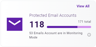
Clicking the View All link navigates to the Clients page and lists each of the 118 protected email accounts.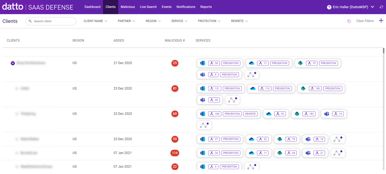
End User Reports
The End User Reports widget conveys the total number of threat incident reports submitted by your end users using the Datto SaaS Defense Report Threat Add-In and the Email Threat Report. This widget provides a great way to monitor and respond to end user feedback which leads to improved security performance for the end user.
Filter selections you make apply to the widget data. 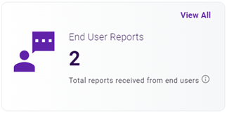
The View All link displays the Events page listing each of the submitted reports.
NOTE To learn more about the Datto SaaS Defense Report Threat add-in, see the article Deploying the Datto SaaS Defense Report Threat Add-In. For more information about the Email Threat Report, see the article Configuring the Email Threat Report.
Threats
The Threats widget breaks down the total number of threats to show the number of threats for each threat type. Each number indicates the total number of threats that were prevented or detected. Data for malicious files, phishing, spoofing, and spam are included. Filter criteria you select applies to the data.
You can display the number of threats for each threat type as a percentage of the total by hovering over its color bar in the chart.
In our example, there were 271 total threats that were prevented or detected during the last week for the seven clients selected. From the total, 229 were spam (85%), 36 were phishing, and 6 were BEC threats.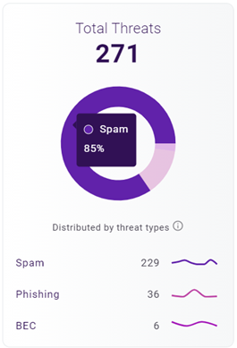
Most Attacked Seats
The Most Attacked Seats widget lists your five most attacked clients, perhaps indicating the need to investigate the clients' environment and security configurations. Ranking is based on clients with the highest percentage of seats subjected to an attack. For this widget, an attack includes malicious files or links or involves spoofing. It does not include spam. Filter selections you make apply to the results.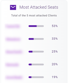
Hovering over a client's color bar displays the number of seats subjected to an attack from the client's total number of seats. In the example, 6 of the client's 30 seats, or 20% were subjected to an attack.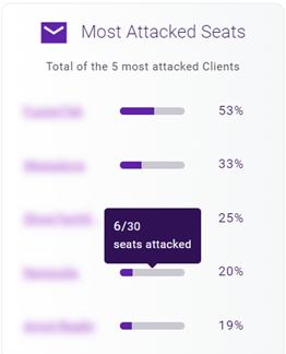
You can click a client's name to navigate to the Malicious page where the malicious and quarantined scans for only the selected client are listed.
Scans Traffic
The Scans Traffic widget illustrates the number of scans performed on each service. Any filters selected are applied to the results. These items are scanned for each service:
- Outlook: Emails
- OneDrive: Files
- SharePoint: Sites
- Teams: Attachments
In our example, the widget shows that 67,818 scans were performed across the Microsoft 365 services for the seven selected clients during the last week.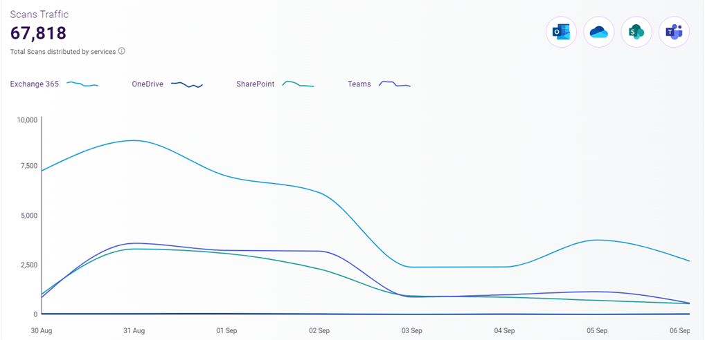
You can click a service icon to display data for that service only. In this example, the Outlook icon was clicked and therefore, only the data for Outlook is displayed. 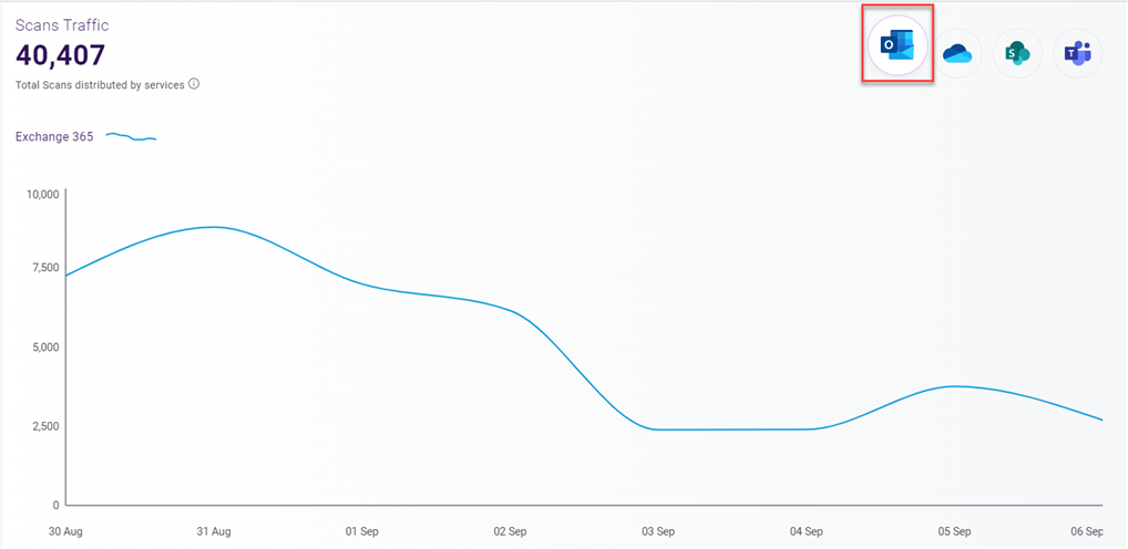
To display data for all the services, click the Outlook icon again.


